


To look forward, sometimes you need to look backwards.
In the case of Goldman Sachs this is exactly what we did, inspired by their annual reports during the turn of the mid-century, the cigarette smoke filled offices and interiors clad in brown, we decided that turning attention back would mean we could position the brand for the future.
A primary colour palette of black and white, to reflect a new transparency we re-branded, repositioned and rolled out changes across 1000’s of touch points.
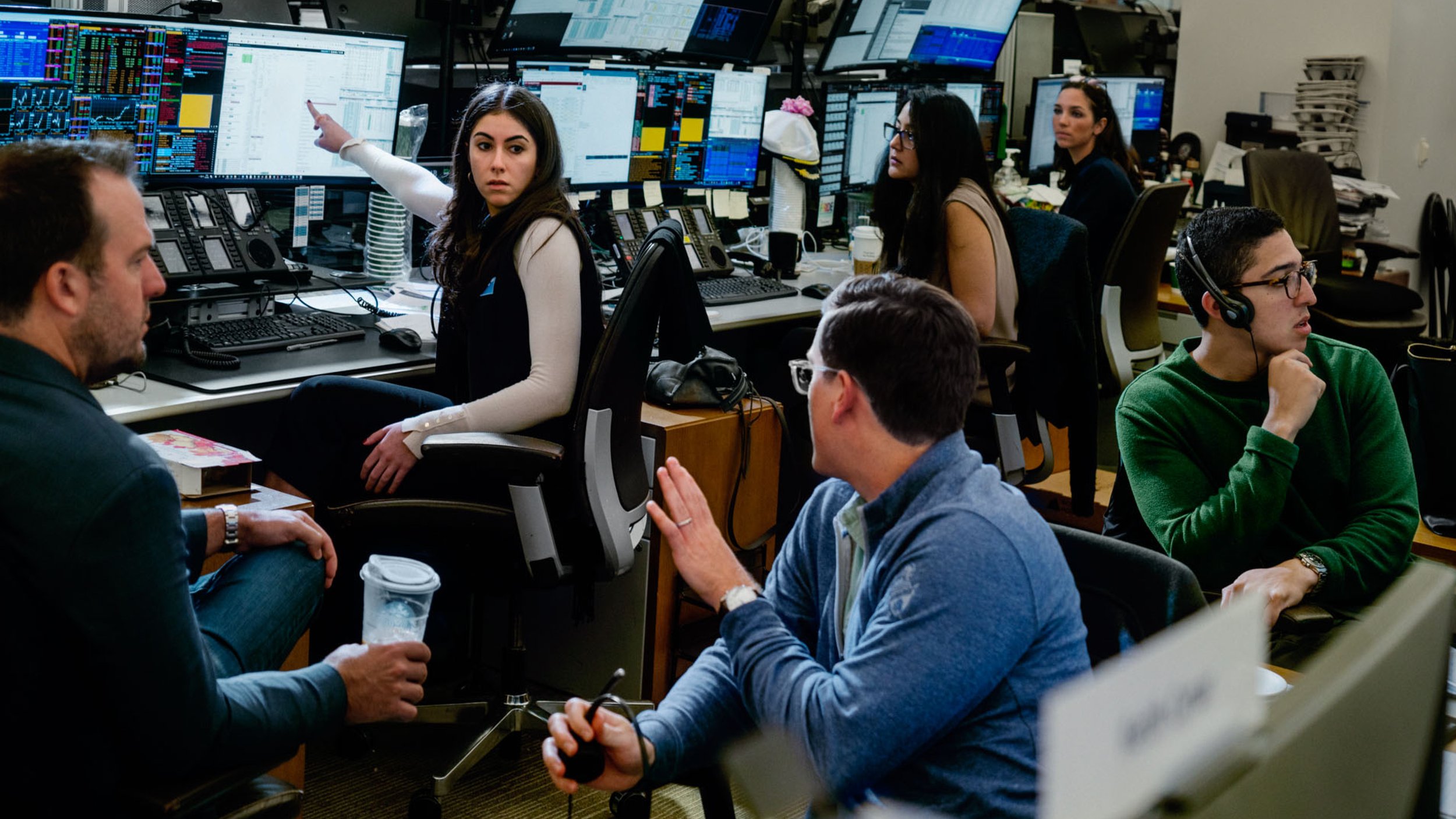
Commissioning magnum photographers, creating an own-able typeface with the help of Colophon and implementing a new tone of voice to help Goldman thrive in the sea of blue banking institutions to rollout Goldman’s first rebrand since the early 80’s.